This is Domino’s reimagined. Better food, bold design, same fast delivery.
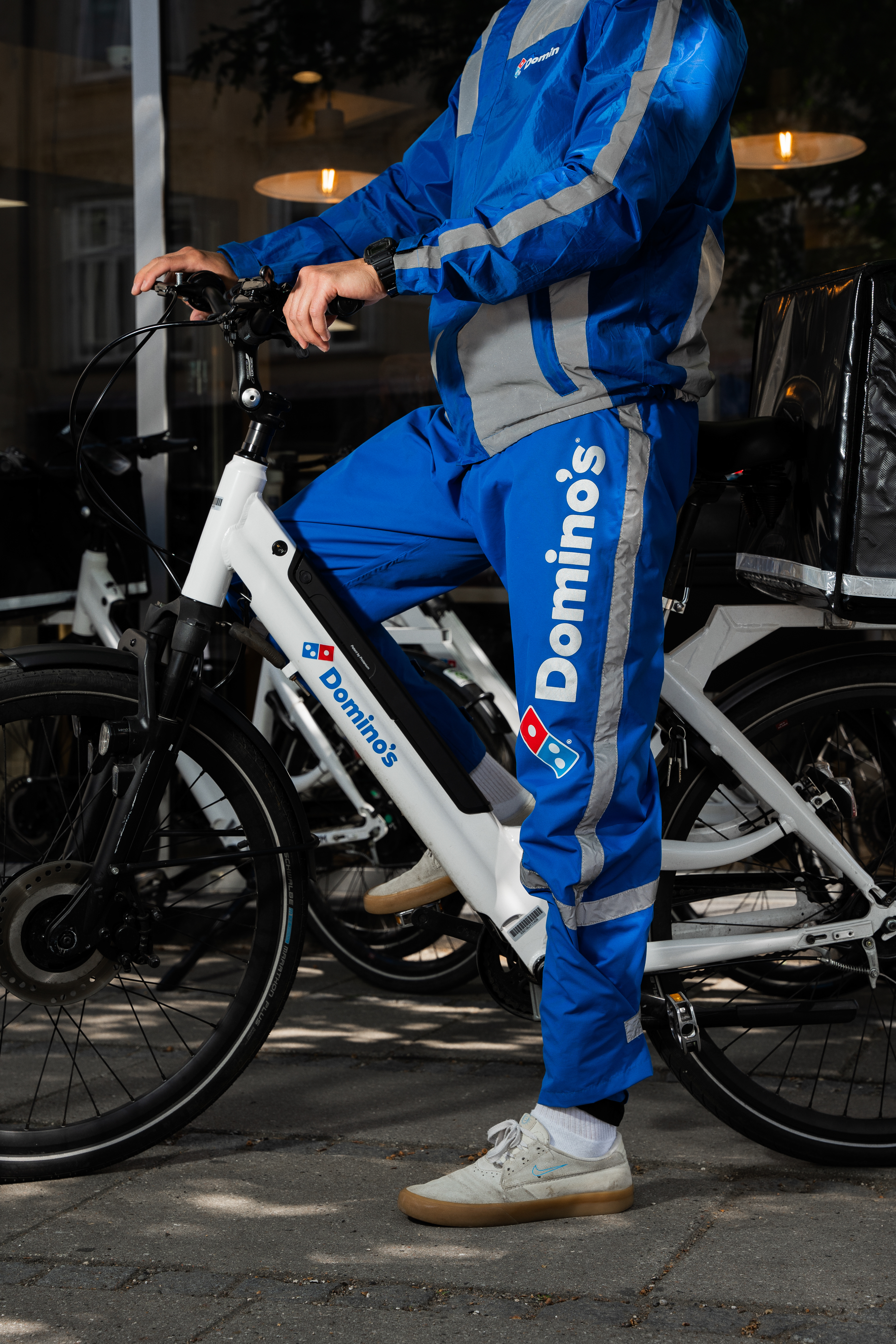
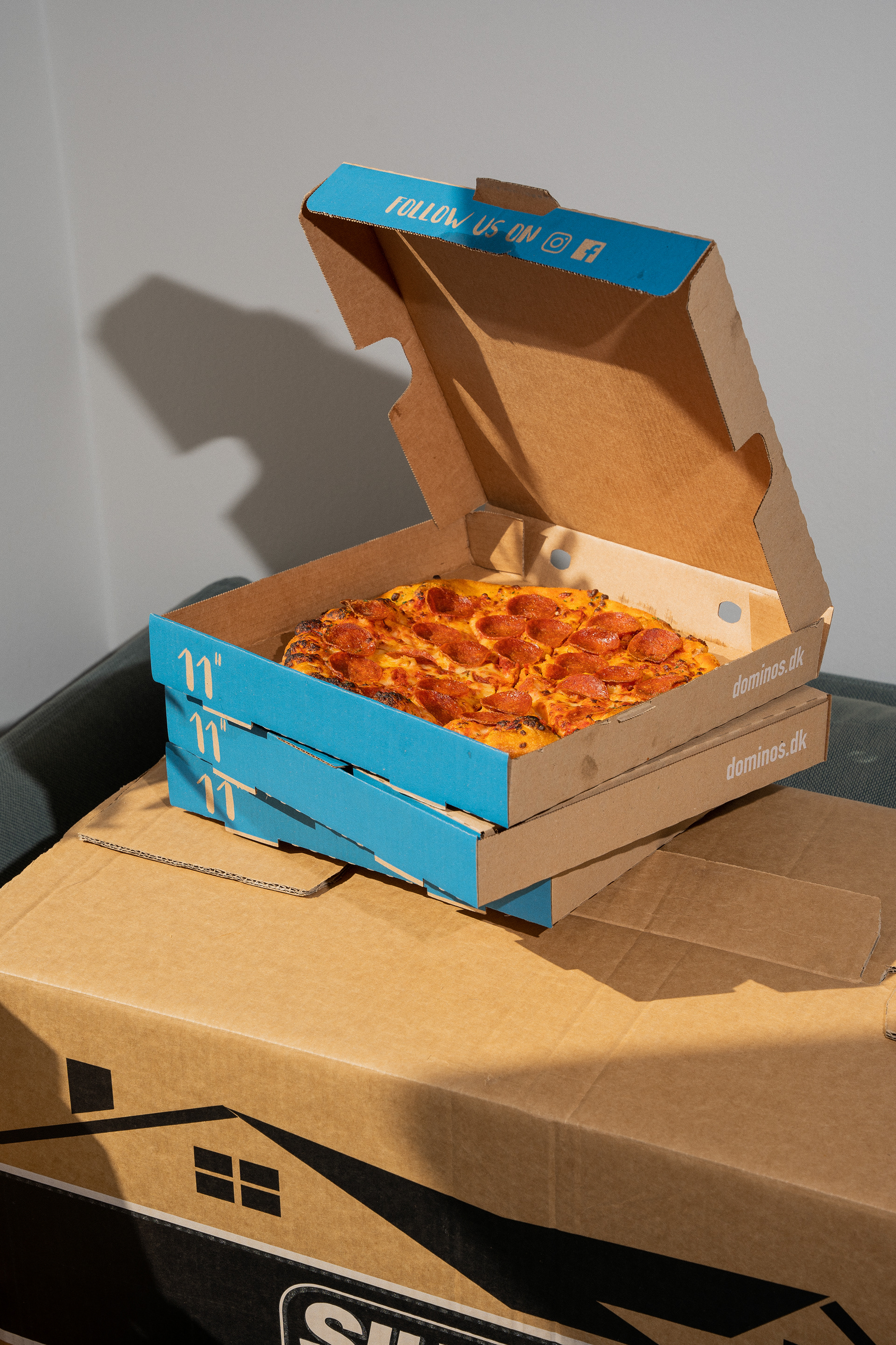
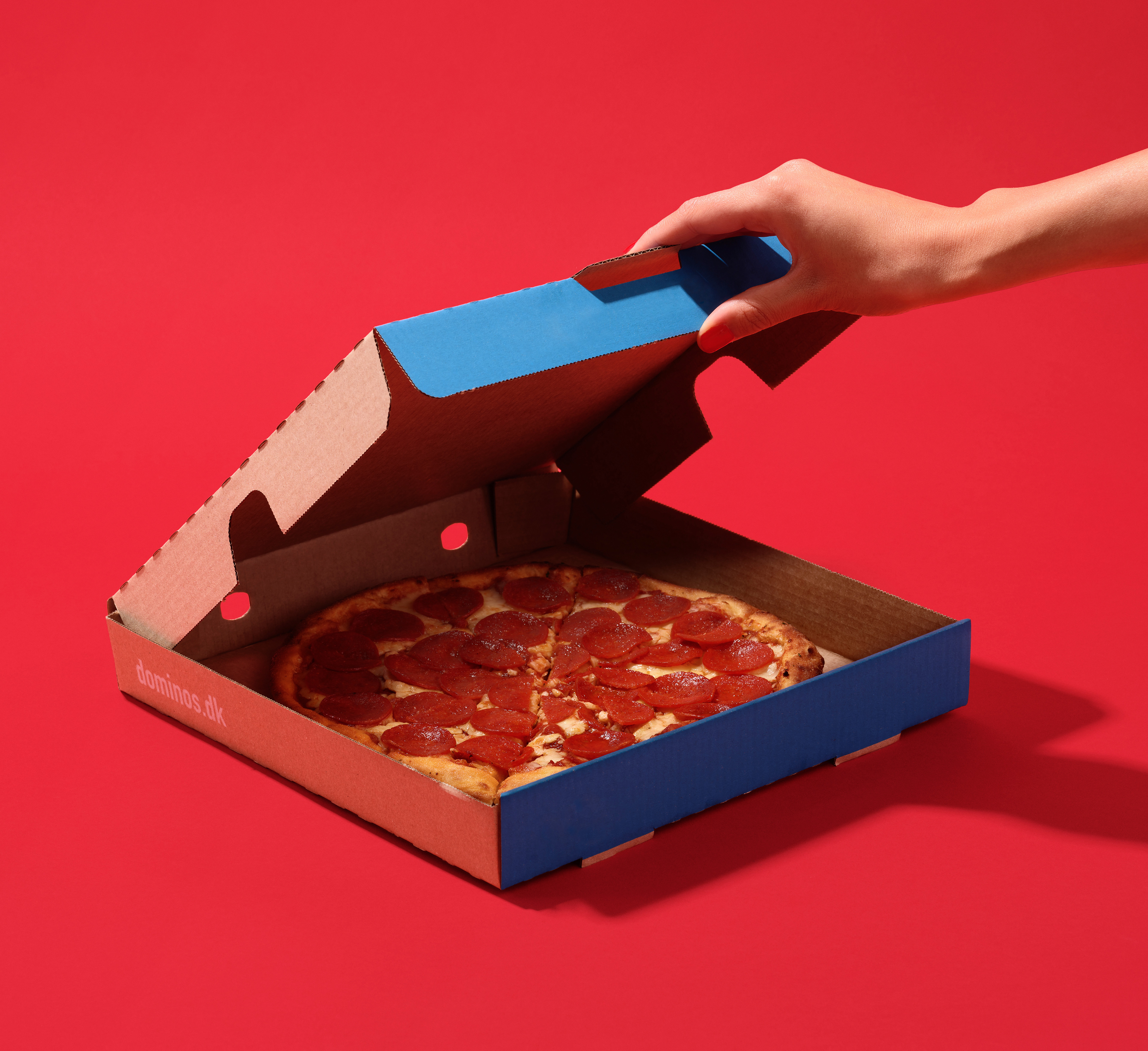
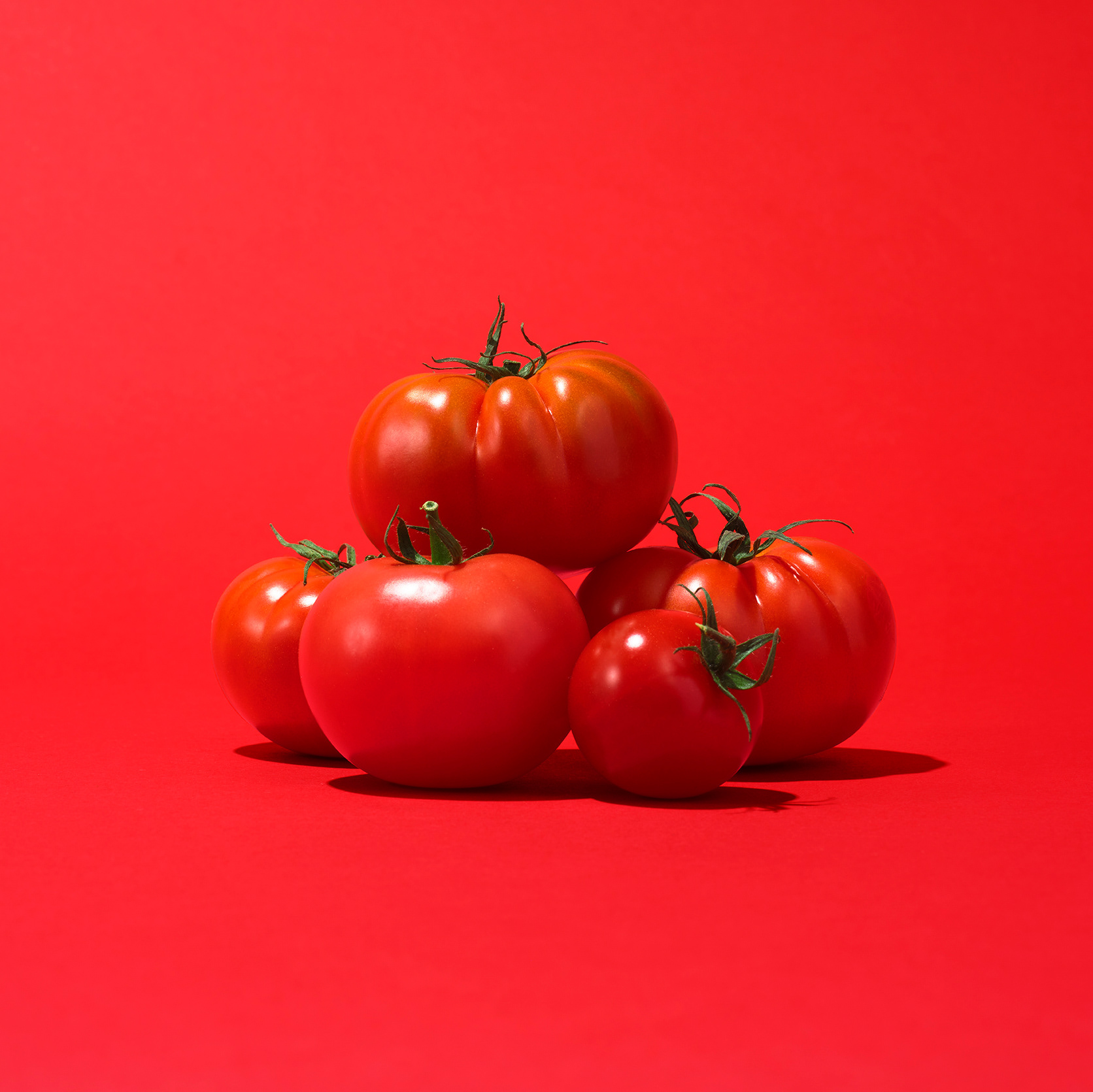
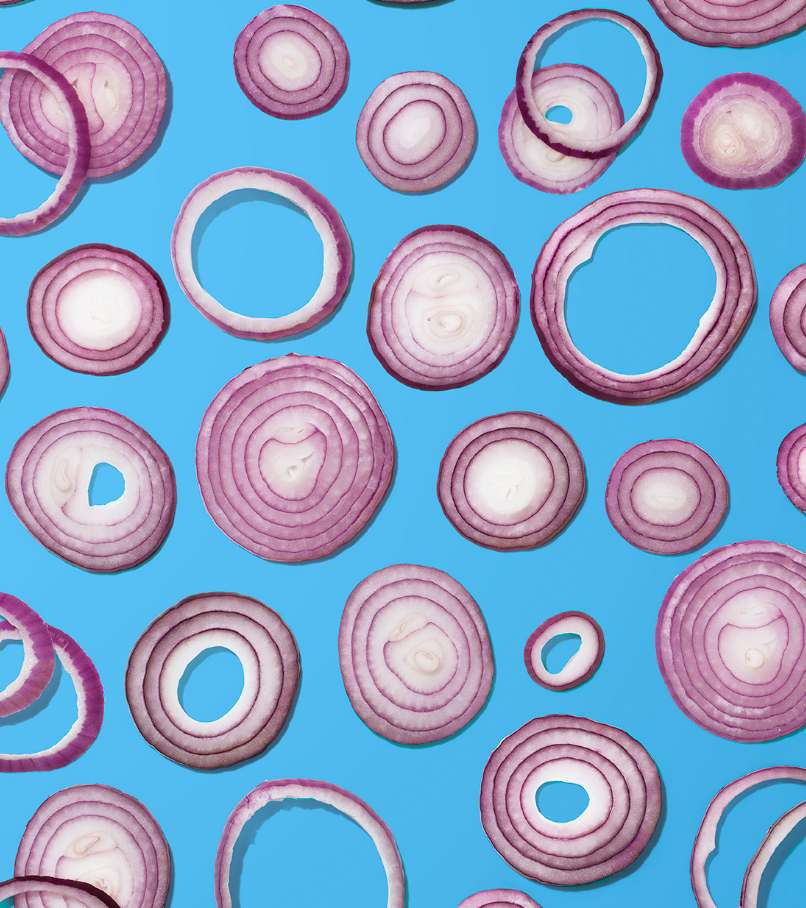
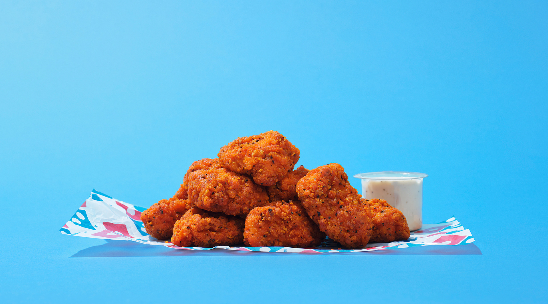
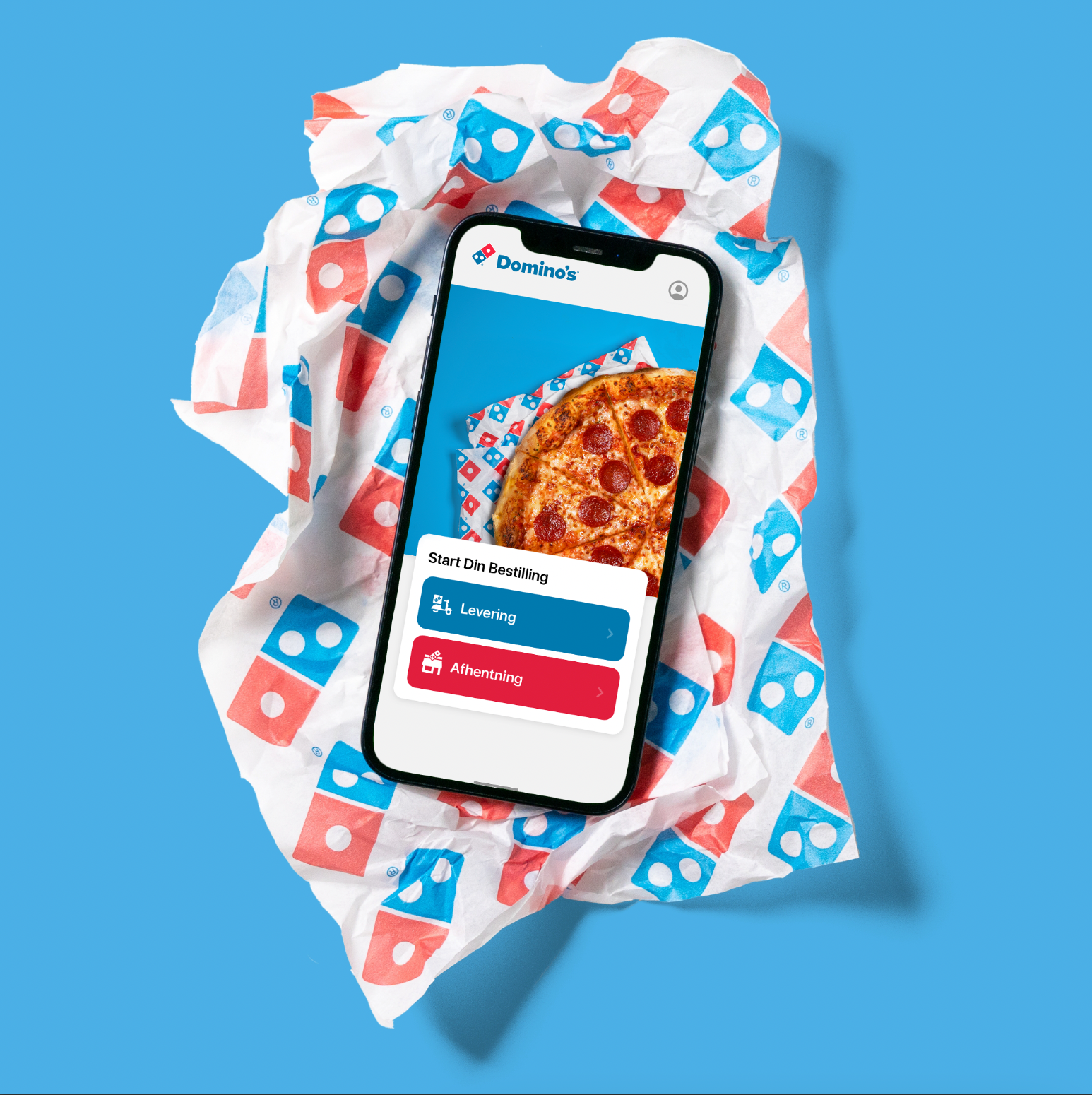
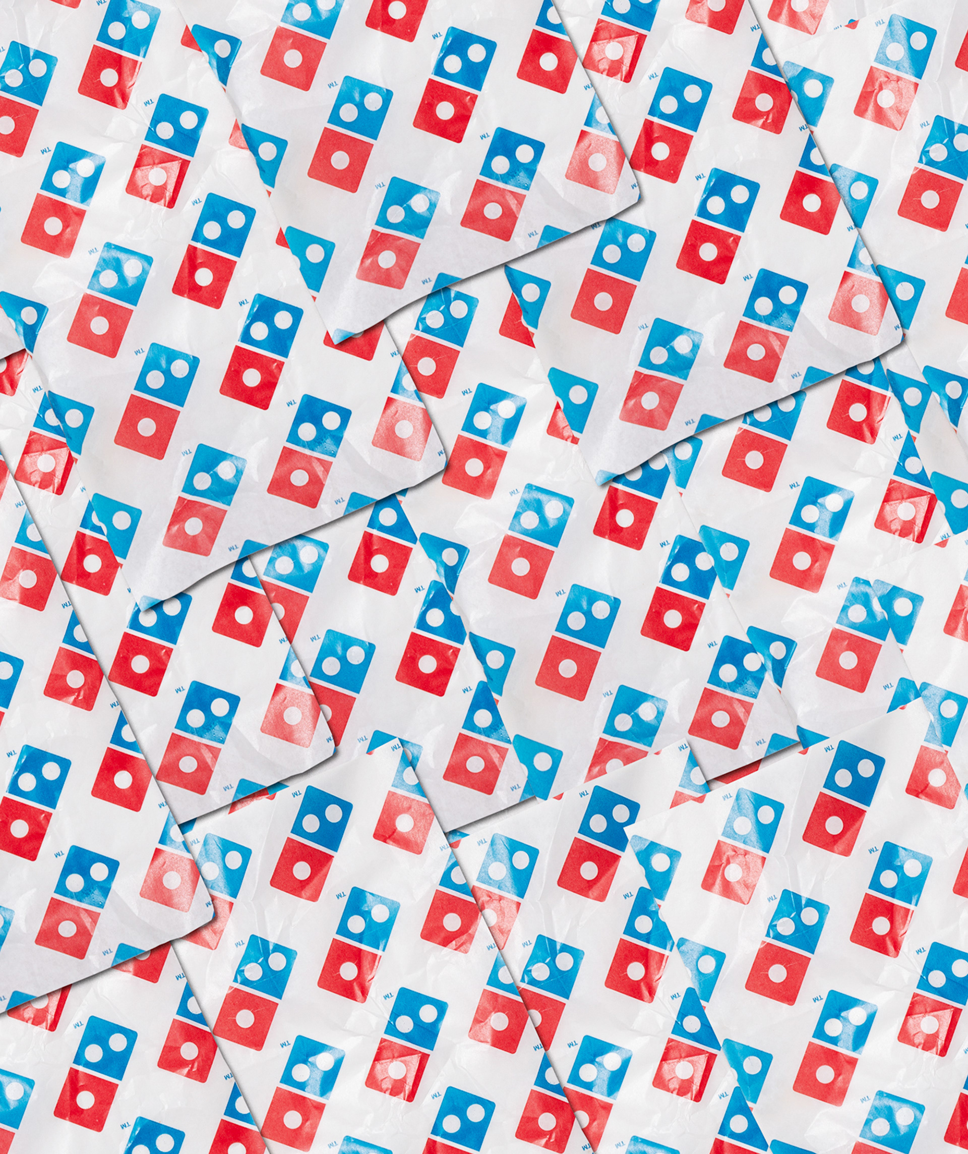
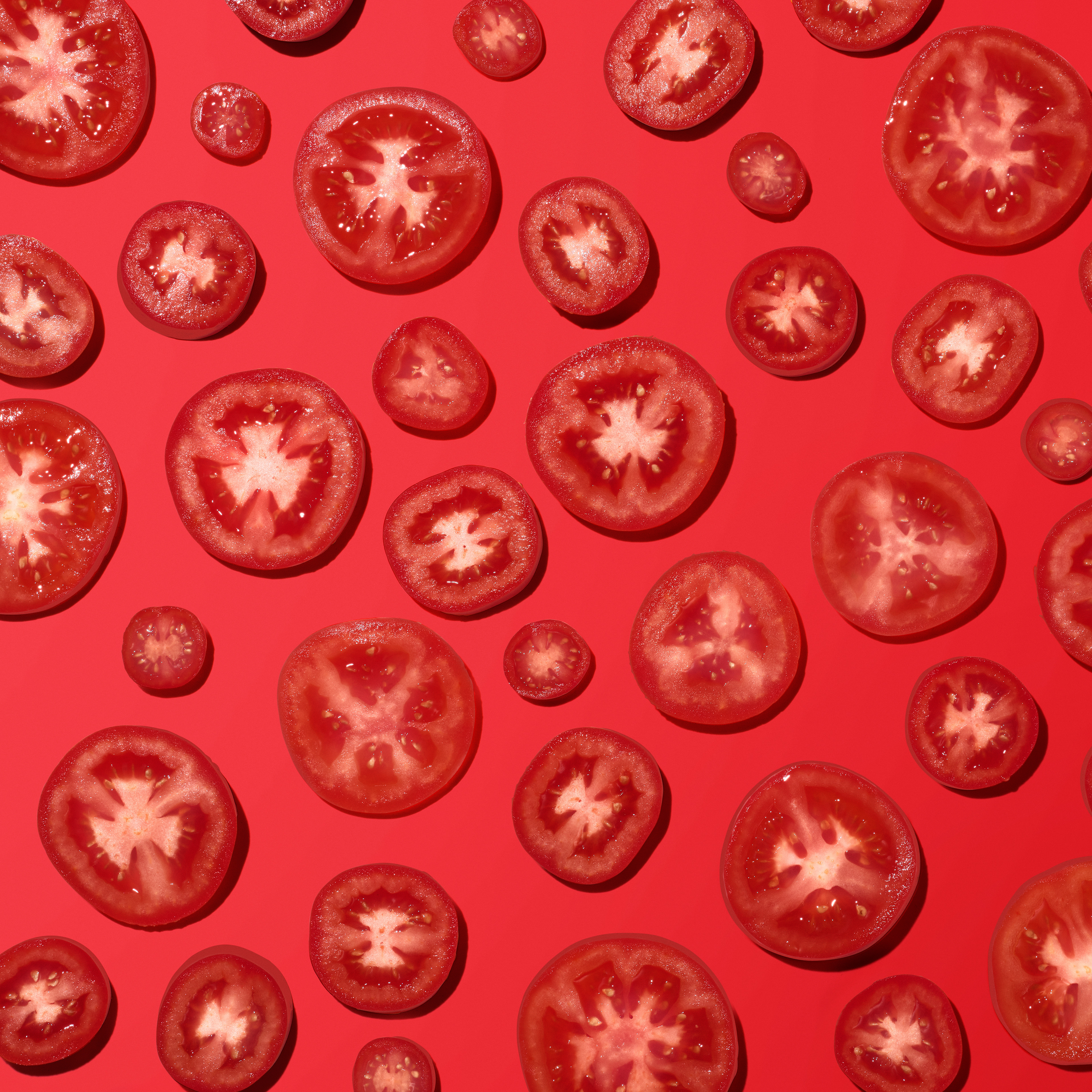
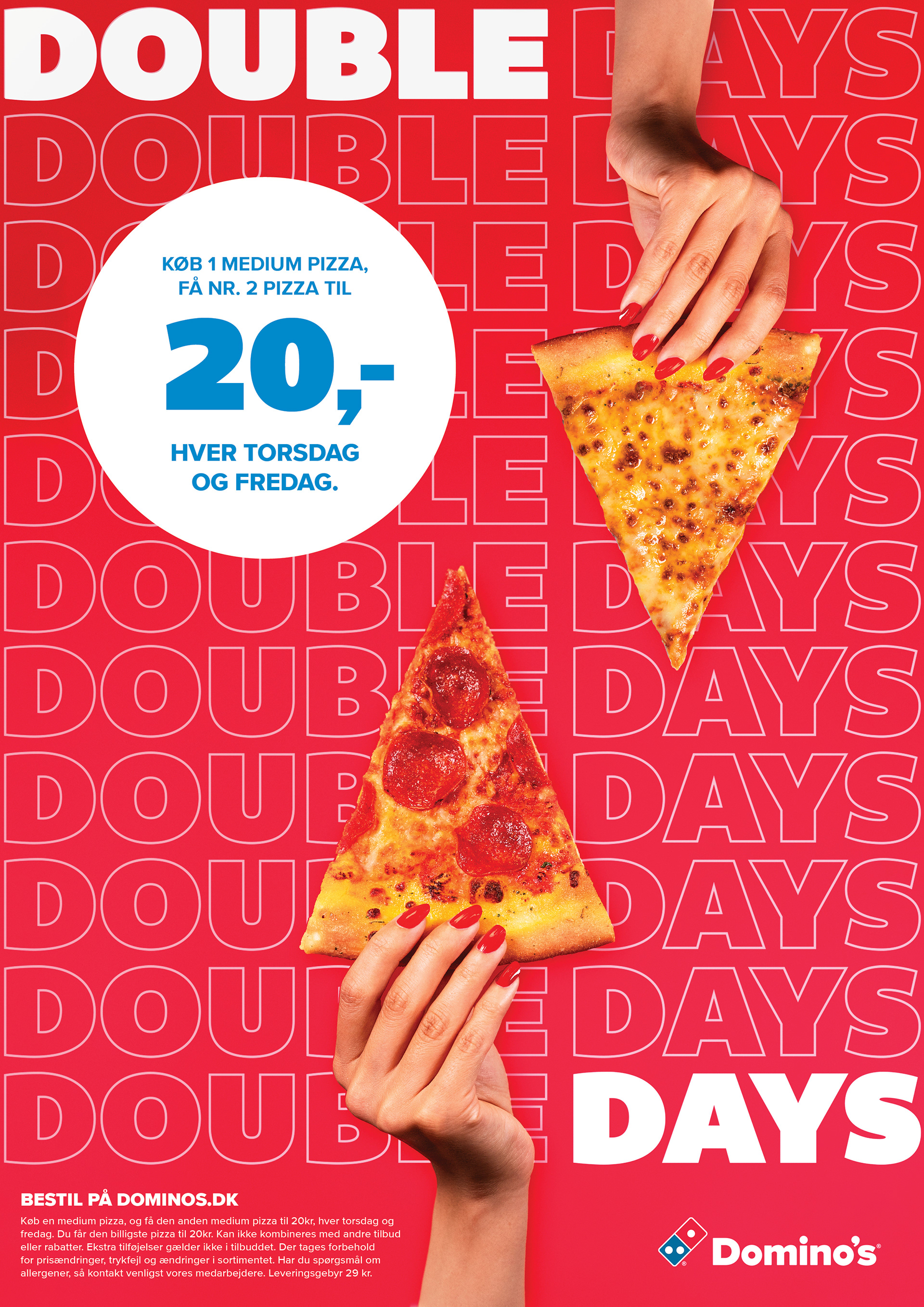
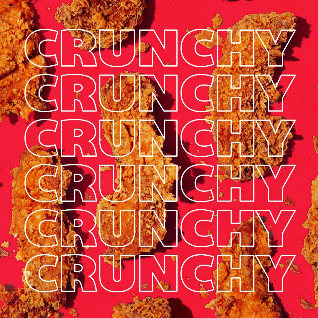
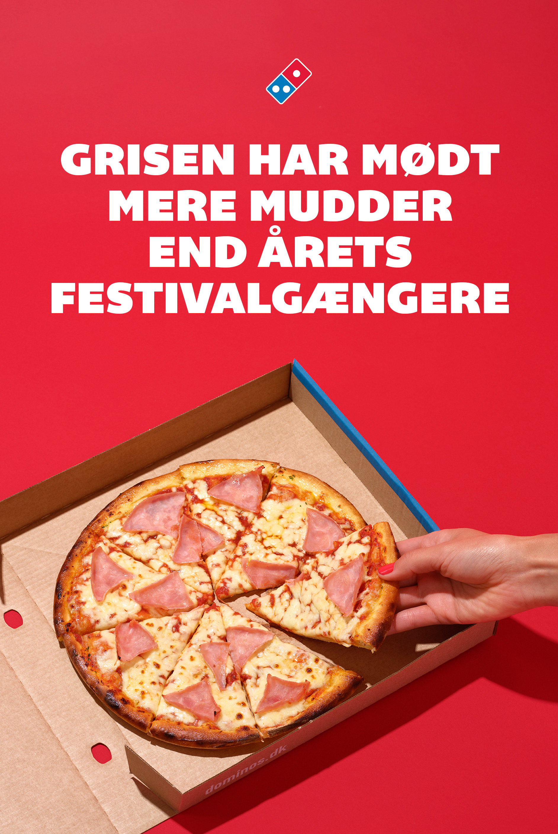
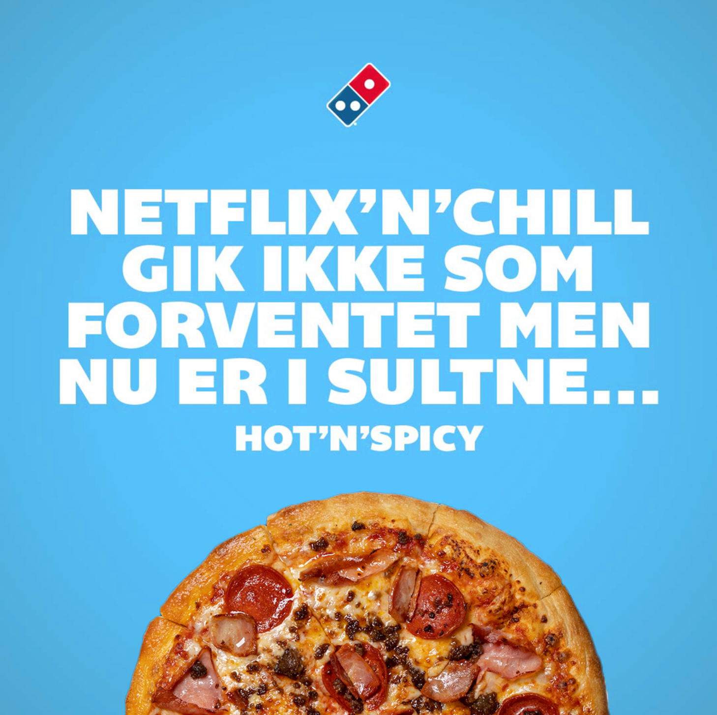
A fresh start for Domino’s with new ownership, better ingredients, and improved quality. The visual identity needed to reflect this shift. By using the three key elements from the logo – the bold, recognizable brand colours and the clean white dot – we created a flexible art direction and more appetizing visuals across all media, while still capturing the playful spirit of bold American fast food.
Concept / Design / Art Direction

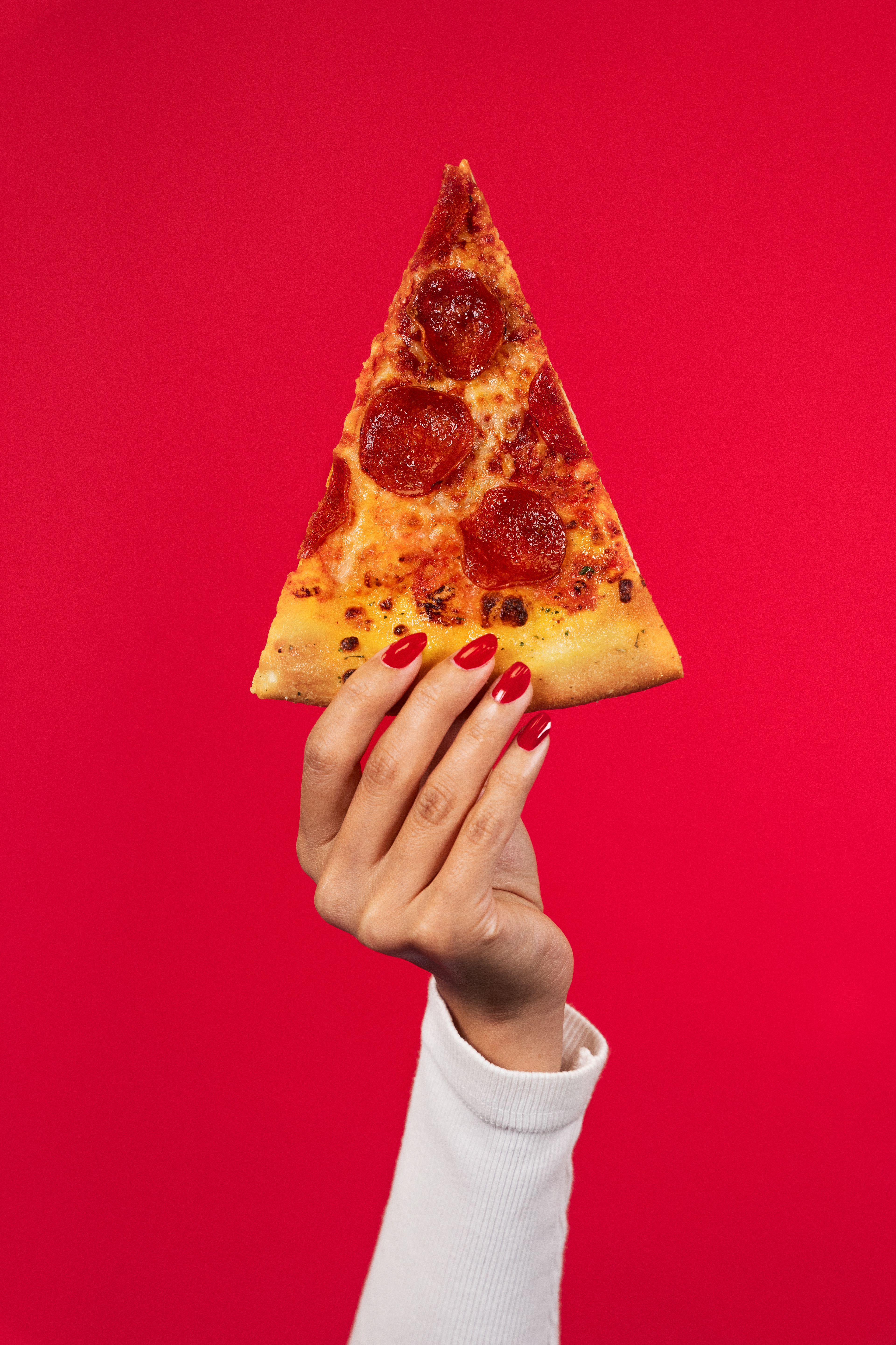
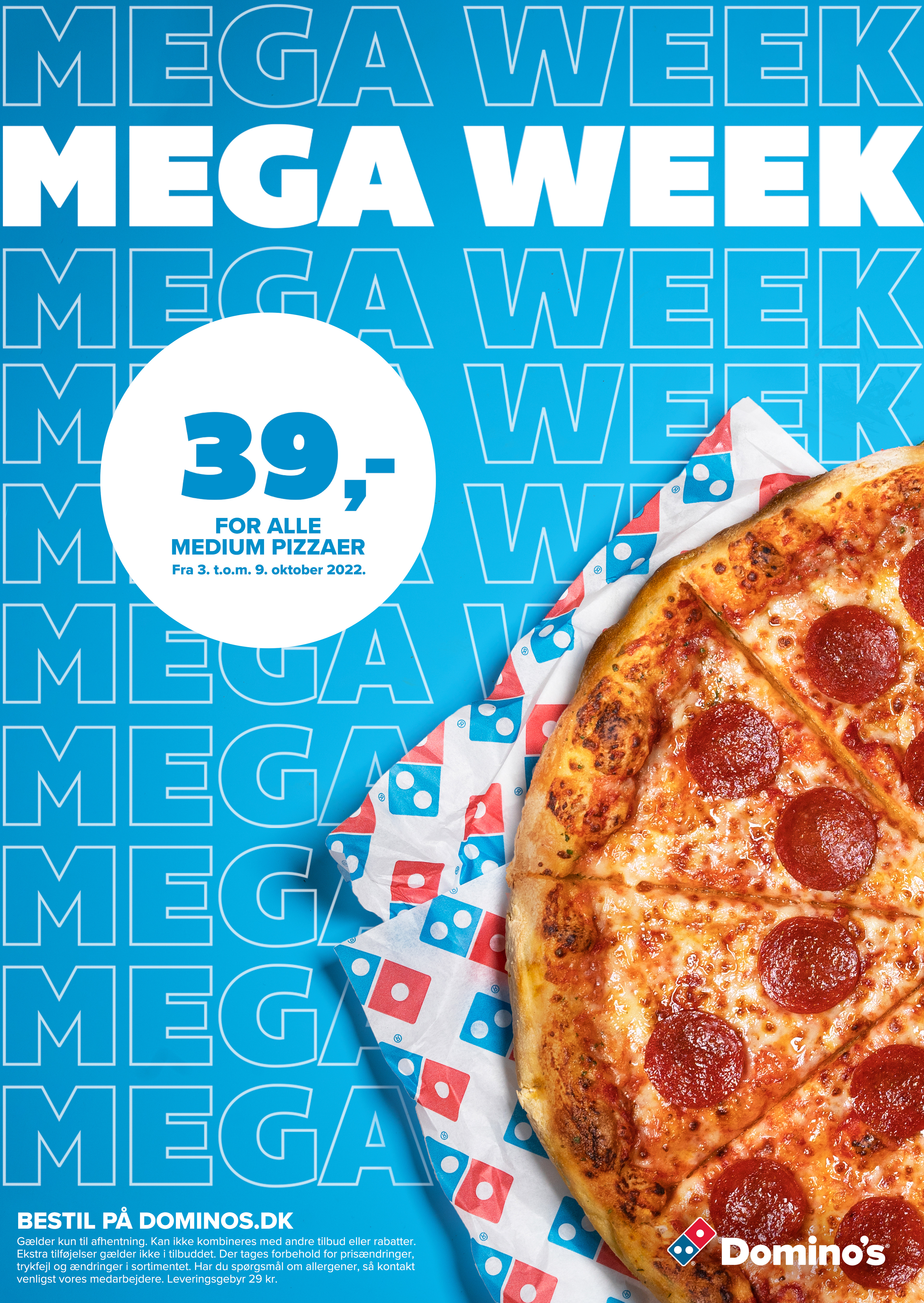
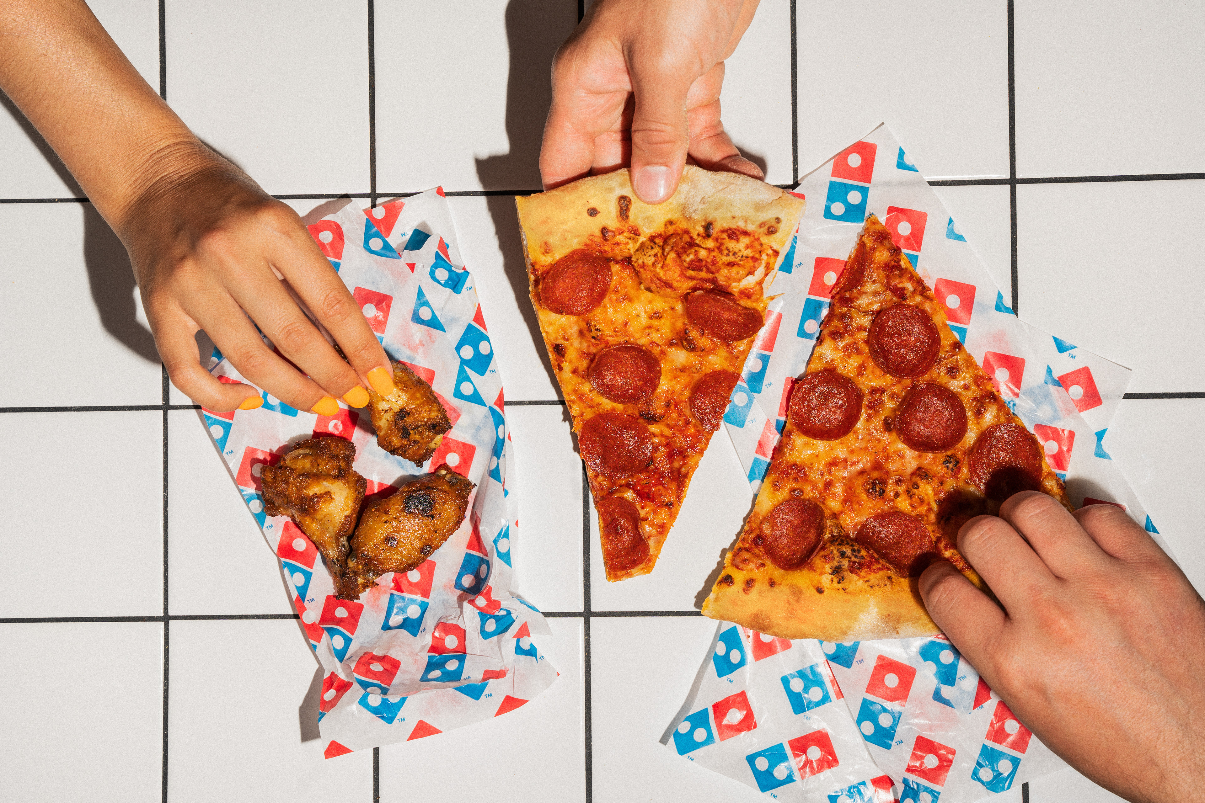
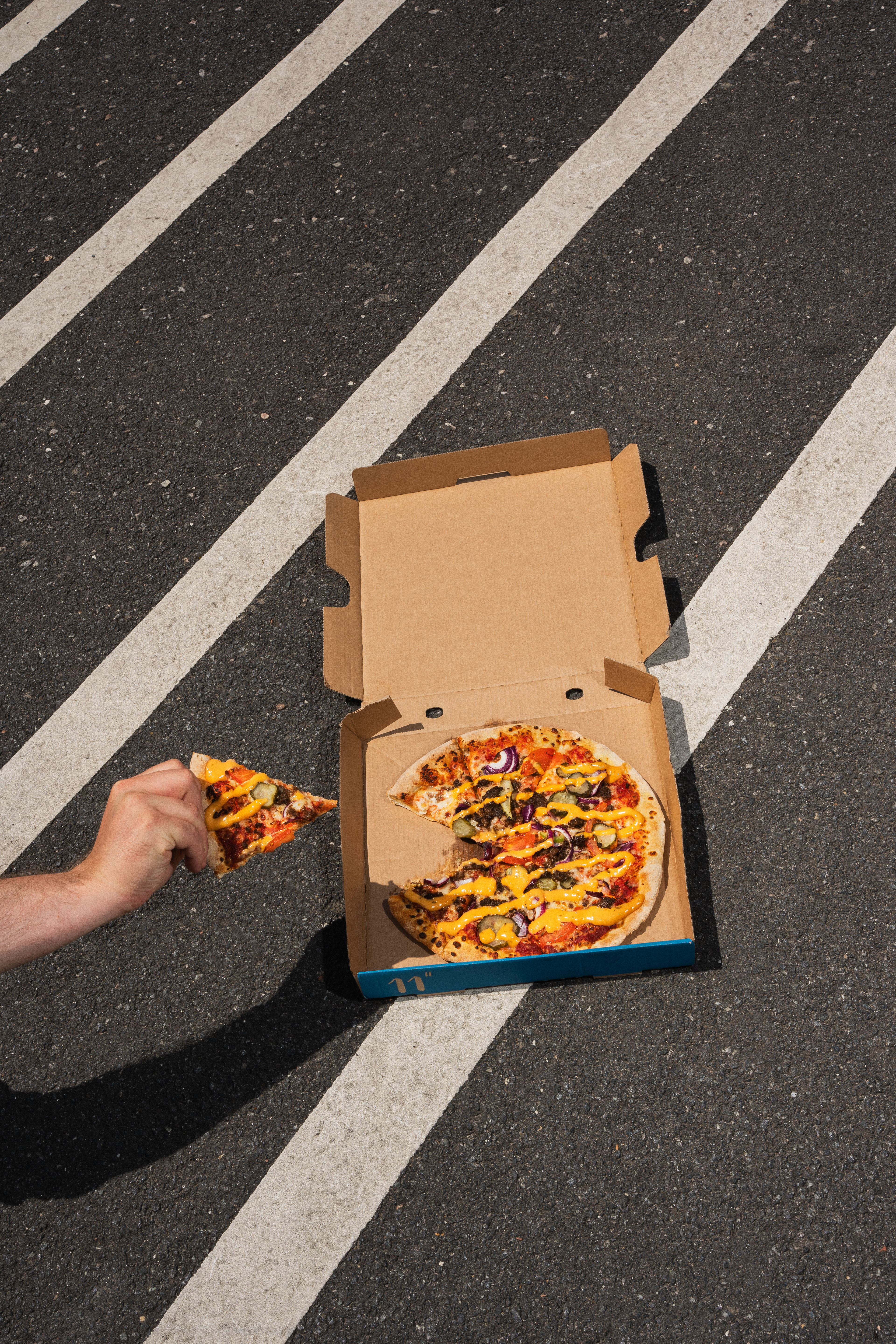
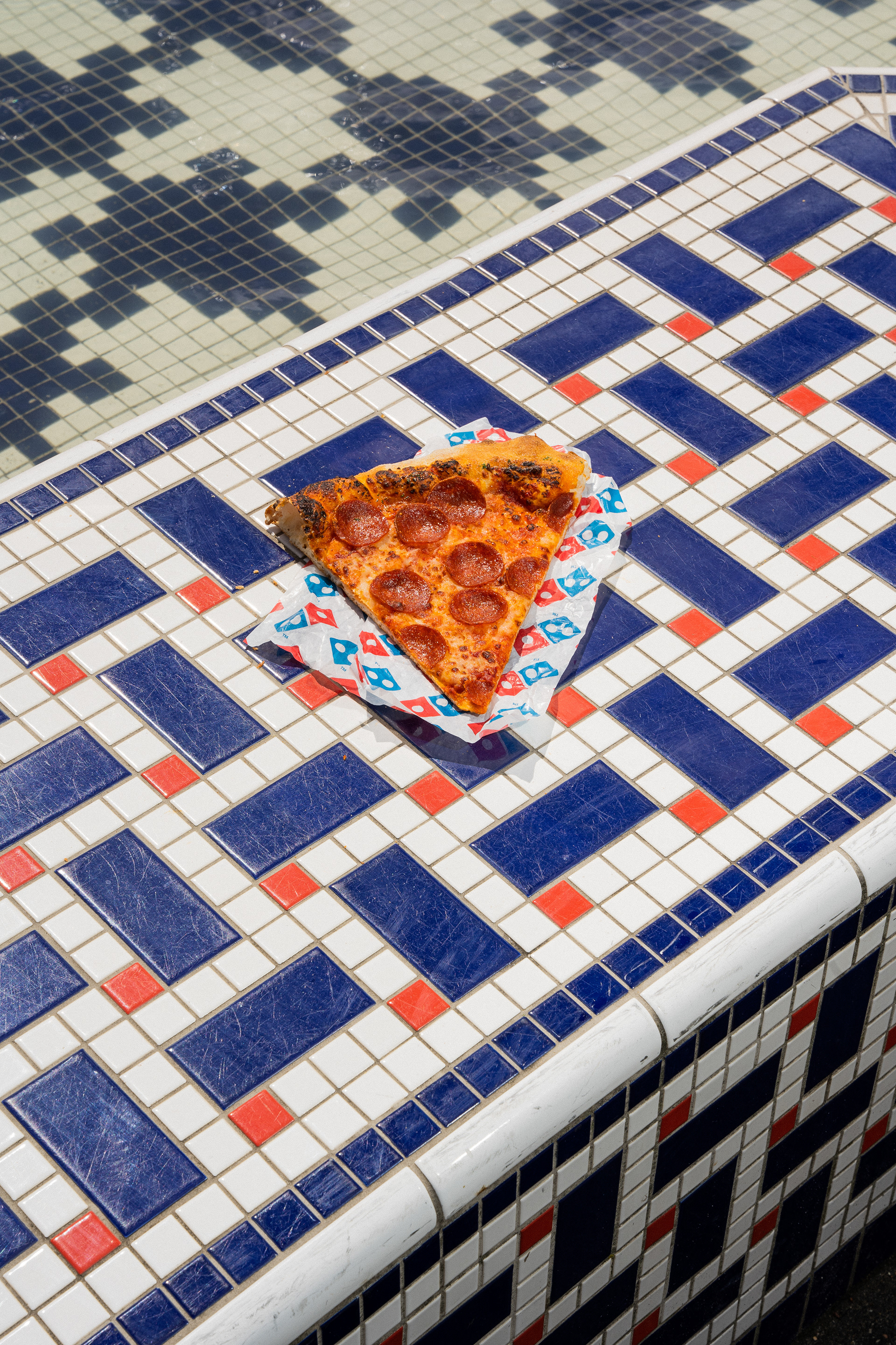
An art direction universe focused on brand colours and better ingredients, with a flexible backdrop that allows room for playful and bold messaging.


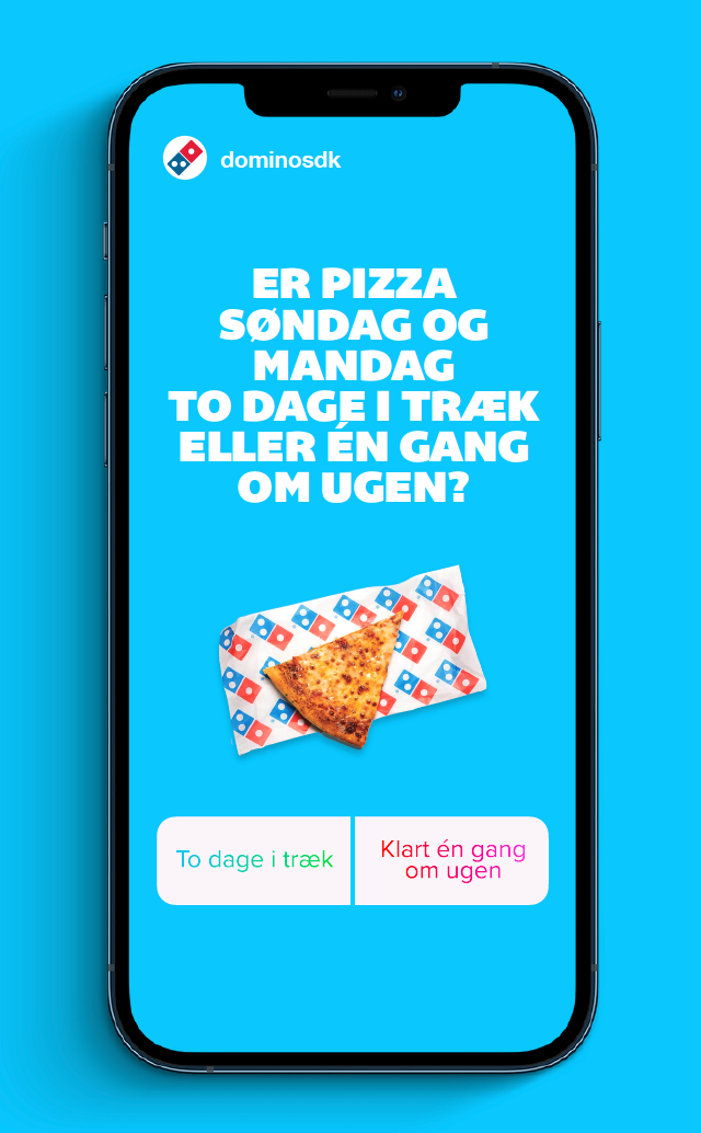
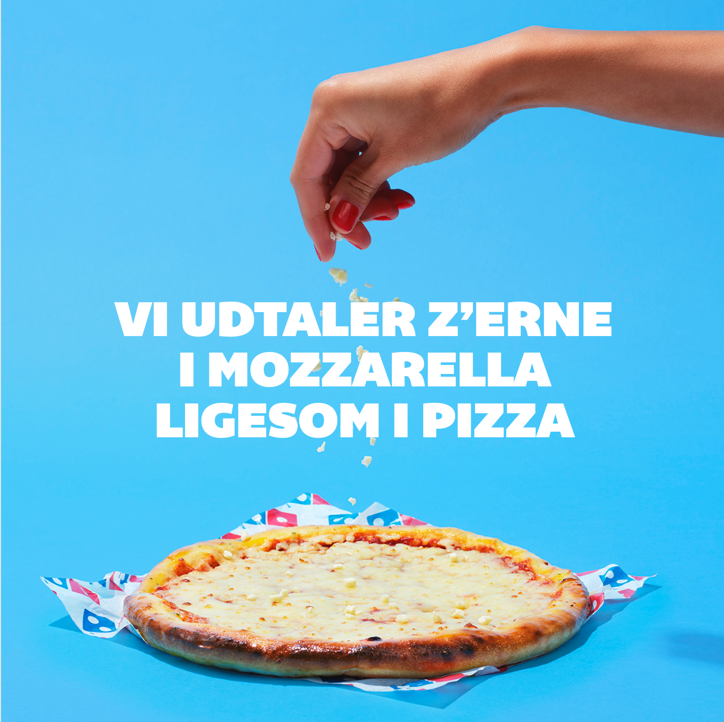
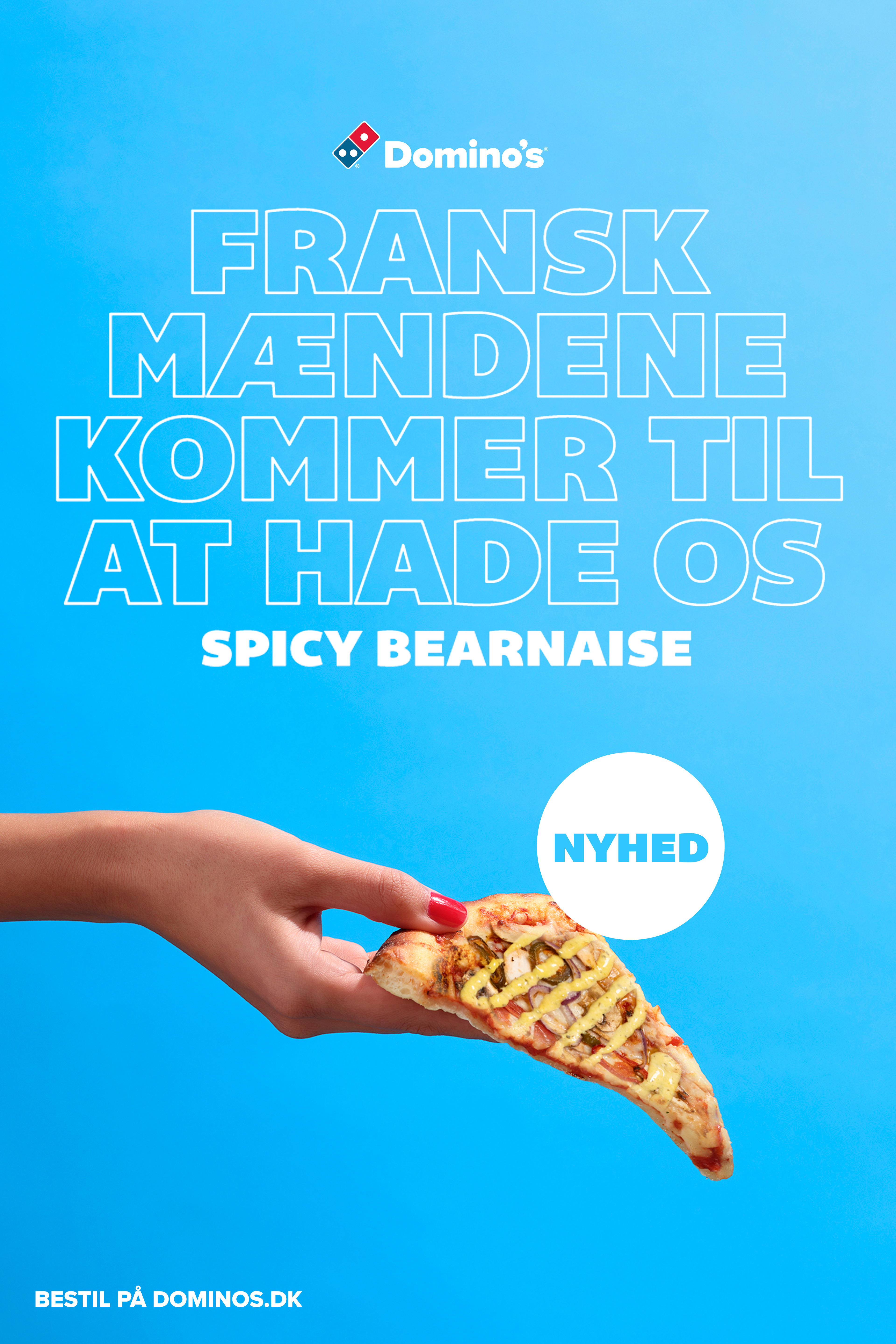
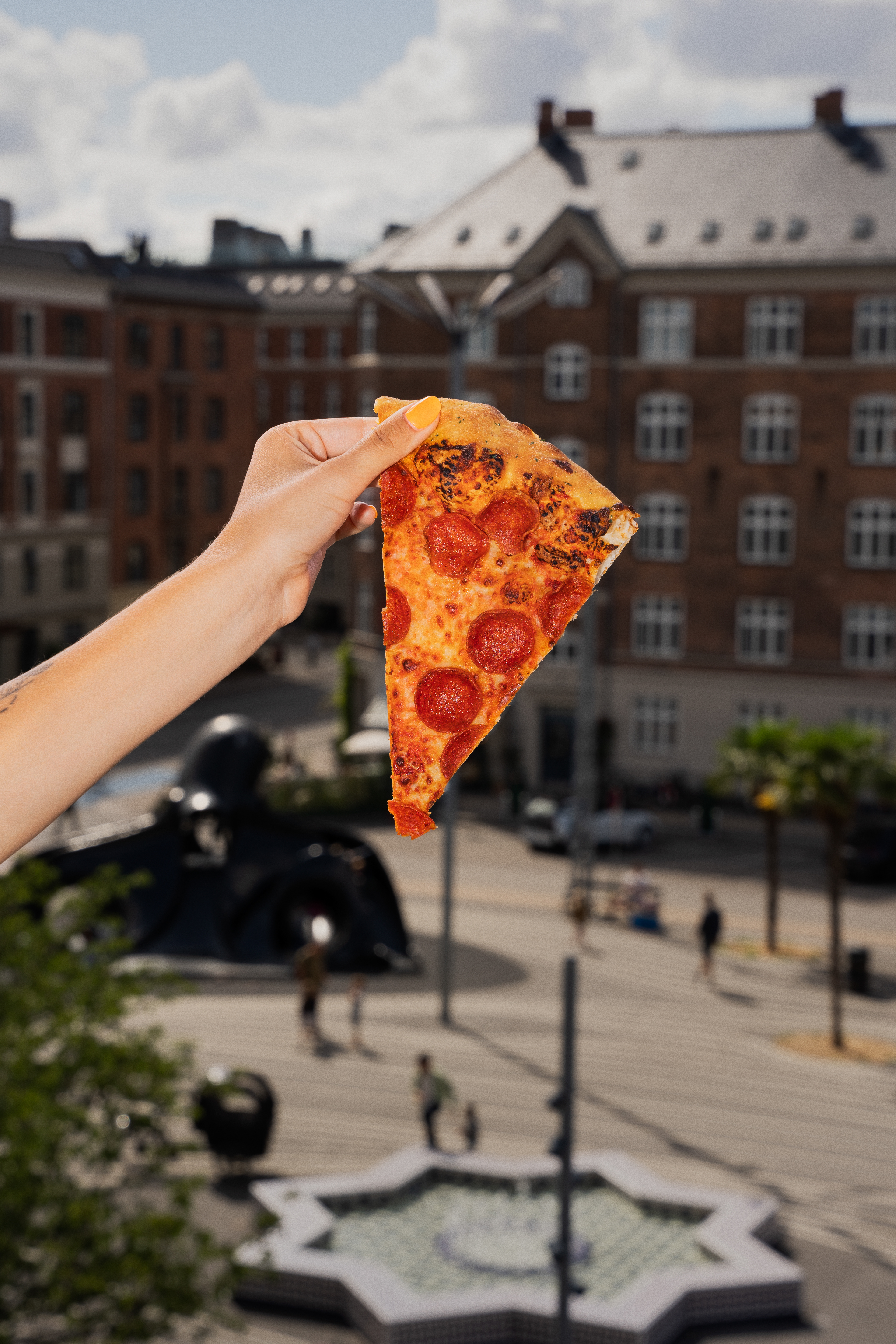
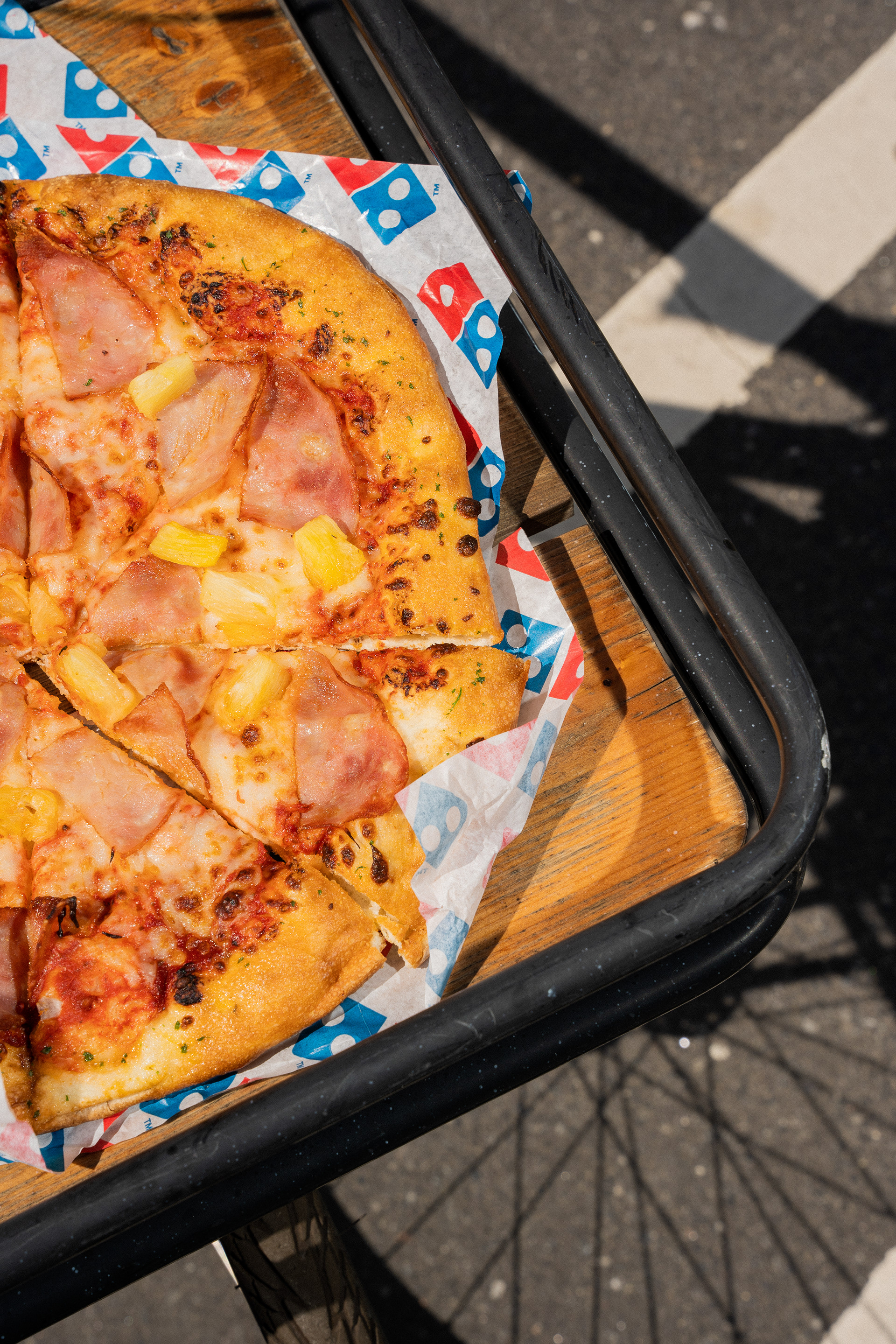
For social media, we also introduced a vibier, lifestyle-driven photo style.